

Data Objects and Attribute Types
Types of Data Sets
- Data records in relational tables, data matrices
- Vectorized text data, document term vectors
- Graphs and networks: the Web, social networks, molecular structures
- Spatial (map), image, and videos
- Sequential: time series, transactions, genetic sequence data

To compute is to reckon with numbers. We deal with many different types of data: transactions and records in databases, text and human languages, graphs and network data, among others.
Ultimately, all data may need to be transformed so they are computable: codes of categories that can be compared, levels ranked in an order, real numbers, decimal values, integers, or boolean values.
Data Objects
- Data sets are made up of data objects.
- A data object represents an entity.
- Also called samples, examples, instances, data points, objects, tuples.
- Data objects are described by attributes.
- Rows -> data objects
- Columns -> attributes.
| attribute 1 | attribute 2 | .. | attribute k | |
|---|---|---|---|---|
| object 1 | ||||
| object 2 | ||||
| .. | ||||
| object n |
When we talk about data, they normally appear in a tablulated or matrix format, with data objects or instances as rows, and attributes or variables as columns.
Examples:
- sales database: customers, store items, sales
- medical database: patients, treatments
- university database: students, professors, courses
As we employ computers to crunch data to find meaning and insight, we need to understand the basic form of data, their basic data types and implications.
The data type of a variable determines the kind of operations that can be performed on its data values. So this is something we need to pay close attention to throughout the process.
Attribute Types
- Nominal: categories, states, or “names of things”
- Hair_color = {auburn, black, blond, brown, grey, red, white}
- marital status, occupation, ID numbers, zip codes
- Binary
- Nominal attribute with only 2 states (0 and 1)
- Symmetric binary: both outcomes equally important, e.g., gender
- Asymmetric binary: outcomes not equally important, e.g., medical test (positive vs. negative)

A categorical variable can have named values (labels or categories) without an order. We refer to such variables as nominal, of which values are from a set of names or labels. The very basic form of a nominal variable is a binary one, where there are two possible named values: true or false, yes or no, 0 or 1, etc.
For many variables, these labels are discrete, mutually exclusive choices without an explicit relation. For example, a State variable can have values such as PA and NY, and there is no relation between PA and NY. One cannot establish such relation as $PA>NY$ or $NY>PA$ unless another variable such as state population is considered. This type of variable is purely categorical, not ordinal. With a categorical variable, we can only use the equality operator to determine whether two values are equal or not, e.g. is PA the same or different from NY.
Ordinal variables are in fact categorical. The values are discrete numbers to be compared and ranked; but other than that, no mathematical operations can be performed on them. In fact, they do not have to be numbers. For example, an Education variable with values such as high school, college, and graduate can be compared and ranked. These are named values with an order.


An inteval scale variable is one that is measured on a scale of equal-size units. Values can be compared and data can be ranked in an order. In addition, one can submit one value from another to calculate the difference.
A temperature in C or F is interval scaled. We can say that today's temperature is 2 degrees higher than yesterday's. However, it makes little sense to add temperature up as the total temperature.
There is no well define zero point here. It is in fact misleading to take the ratio between two temperature values and conclude that one is 10% lower than the other. Without a true zero value, such a claim has little scientific value.
So subtraction can be performed on a interval scaled variable; however, division is less meaningful.

Now, if a variable does have a well-define zero value, it is ratio-scaled. Data related to length, counts, and money are in general ratio scaled. On such a ratio-scaled variable, many mathematical operations such as subtraction, addition, and division can be performed.
So it is now meaningful to do subtraction, addition, division, and even multiplication on the ratio variable.
Discrete vs. Continuous Attributes
Discrete Attribute:
- Has only a finite or countably infinite set of values
- Nominal values, integer coding
- Binary attributes are a special case of discrete attributes
- E.g., zip codes, profession, or the set of words in a collection of documents
Continuous Attribute
- Has real numbers as attribute values
- Practically, real values can only be measured and represented using a finite number of digits
- Continuous attributes are typically represented as floating-point variables
- E.g., temperature, height, or weight
Summary of Attribute Types
| Type | # Values | Order? | Interval? | Zero Point? | Remarks, allowed operations |
|---|---|---|---|---|---|
| Binary | 2 | No | No | No | 0 vs 1; Yes vs No |
| Nominal | 2 or more | No | No | No | Names and labels |
| Ordinal | 2 or more | Yes | No | No | Levels, ranks, < or > |
| Interval | $\to\infty$ | Yes | Yes | No | Difference, subtraction |
| Ratio | $\to\infty$ | Yes | Yes | Yes | Sum, ratio, division |
The table summarizes what we have discuss about the type of variables, what make them different, and how they should be treated differently. Think about data you have experienced recently, the types of variables there, and what data types you think they should belong to. This is a useful exercise and a good starting point before putting your hands on data.
- To better understand the data: central tendency, variation and spread
- Data dispersion characteristics:
- median, max, min, quantiles, outliers, variance, etc.
- Numerical dimensions correspond to sorted intervals
- Dispersion analysis on computed measures
Once we know the type of data we are dealing with, we can look at the basic statistics based on data samples. For numeric data, we want to look at the central tendency, variation, and spread of the distribution.
First, on the central tendency, we have basic statistics such as the mean, the median, and mode. The mean is simply the overall average, often estimated by a sample. The median is the value in the very middle of sorted data. The mode is the most frequent value, or values.
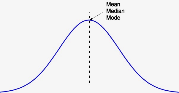
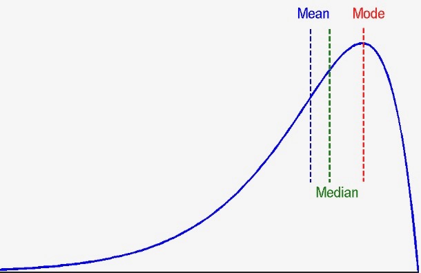
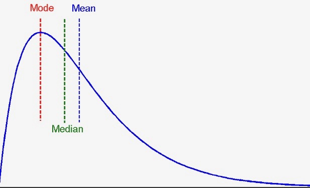
Putting these three values togehter gives us a rough idea about the kind of distribution in the data. When the mean, median, and mode are all about the same, it is a symmetric distribution where the average is in the middle and the peak.
When the values do not agree with one another, the distribution can be negatively skewed, as shown in the left figure; or positively skewed, illustrated in the right figure.
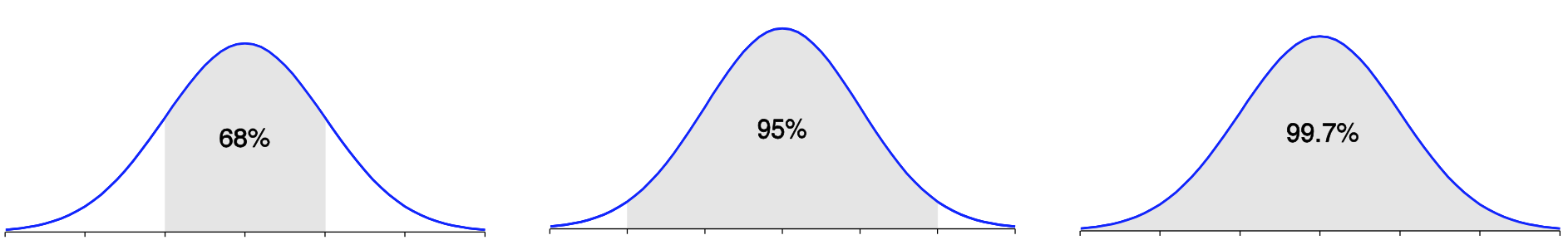
Properties of Normal Distribution
The normal (distribution) curve:
- $\mu$: mean
- $\sigma$: standard deviation
Observation of any normal curve:
- From $\mu-\sigma$ to $\mu+\sigma$: contains about 68% of the measurements
- From $\mu-2\sigma$ to $\mu+2\sigma$: contains about 95% of it
- From $\mu-3\sigma$ to $\mu+3\sigma$: contains about 99.7% of it
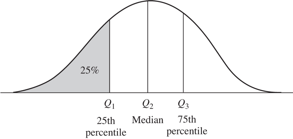
Besides the mean and median, quartiles are useful for measuring the dispersion of data.
Q1 is the 25th percentile, Q2 is the 50th percentile or the median, and Q3 the 75th percentile.
Adding the minimum and maximum values to these three, we have the five number summary of a distribution.
- Variance: mean squared error
- Standard deviation: the square root of variance
Graphic Displays of Basic Statistical Descriptions
- Boxplot: graphic display of five-number summary
- Histogram: x-axis are values, y-axis repres. frequencies
- Quantile plot: values vs. quantiles
- Quantile-quantile (q-q) plot: compare two distributions and their quantiles
- Scatter plot: putting pairs (two variables) of values together
Graphic presentations of data distributions are often intuitive and helpful. Let's look at some of these tools: boxplot, histogram, quantile plot, QQ plot, and scatter plot.
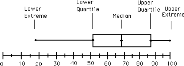
A boxplot is a visual representation of the five-number summary. As shown in the example, it depicts the median, the lower quartile Q1, the upper quartile Q2, in the context all possible values within min and max.
Example boxplot:
Often, boxplots are presented vertically as distributions on the Y axis and X can be used to compare different levels of a predictor variable.
- Data is represented with a box
- The ends of the box are at the first and third quartiles, i.e., the height of the box is IQR
- The median is marked by a line within the box
- Whiskers: two lines outside the box extended to Minimum and Maximum
- Outliers:
- Points beyond a specified outlier threshold, plotted individually
- E.g. values beyond $1.5 \times IQR$, lower or higher
Where the whiskers (lines outside the box) terminate depends on Q1 - 1.5 IQR and Q3 + 1.5 IQR (or some variation of that).
However, they should be within those bounds but not necessarily at the exact values of 1.5 IQRs. In fact, they are extended/drawn to the most extreme observations/instances WITHIN the 1.5 IQR bounds.
Histogram
- Graph display of tabulated frequencies, shown as bars
- Proportion of cases in each range or category
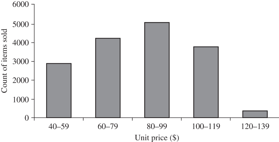
Note equal intervals on the histogram here: $height == area$
A histogram is a graphic display of frequencies, in a number of ranges or bins.
Because of the bar representation, this is very similar and sometimes equivalent to a bar chart. And the histogram here is indeed a bar chart, where the ranges have equal intervals (widths) -- that is, each bar is about the same 20 dollar range.
If the ranges are not uniform, however, this cannot be interpreted as a bar chart. Because in a histogram, what matters is the area of the bar, not the height. And with non-uniform ranges, the height is different from the area of a bar.
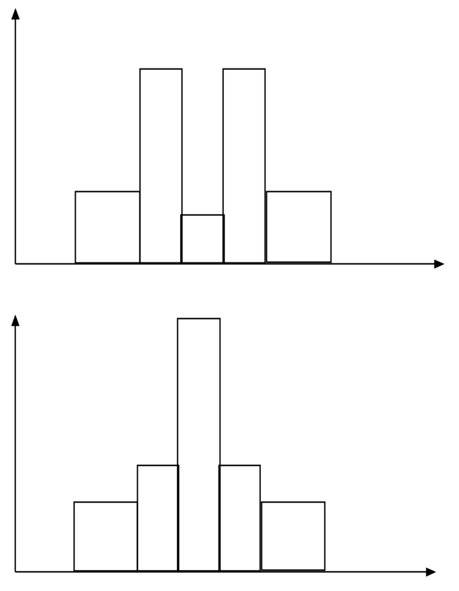
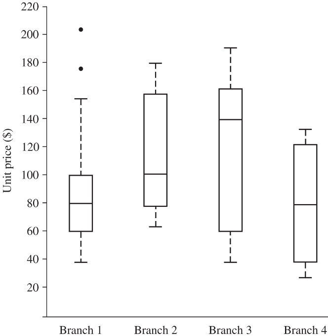
- Two different histograms
- Same boxplots (quartiles)
- Histograms tell more about the distributions
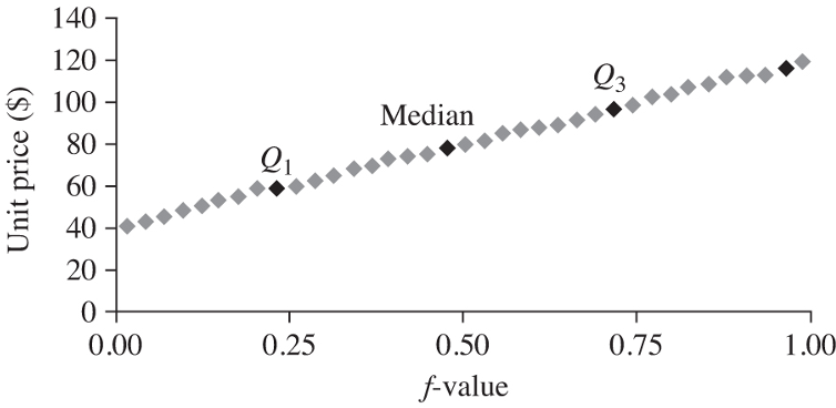
When you take a standard test, you may receive a report about your percentile -- the proportion of others with a grade below you. The quantile here is roughly the same idea. Now the the data values are plotted against the f-value, or quantiles, you can observe the overall pattern and compare to other data.
From the quantiles, you can also identify the quartiles, such as the median, Q1, and Q2. Again, you can assess and compare these values.
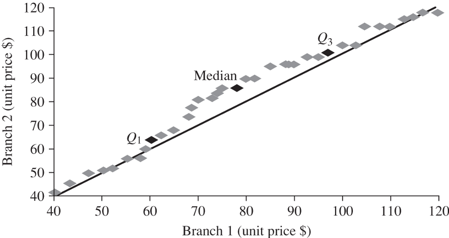
When comparing two data distributions, quantile-quantile or Q-Q plots are especially useful. A QQ plot graphs the quantiles of one univariate distribution against the corresponding quantiles of another.
The example shows the distribution of unit price at one branch vs. that in another branch. The quartiles Q1, Median and Q3 are all above the diagonal line, indicating Y (branch 2) tends to have a higher unit price than X (branch 1) does.
A QQ plot is also useful in situations where you expect a specific distribution model on your data. For example, when you use linear regression -- which assumes normal distributions -- it is necessary to examine the QQ plot of your data distribution vs. the ideal normal distribution. Certain remedies are required if your data are not normal.
With multiple variables, scatterplots are useful for the intial data exploration and may reveal certain relations of variables and potential data clusters and outliers.
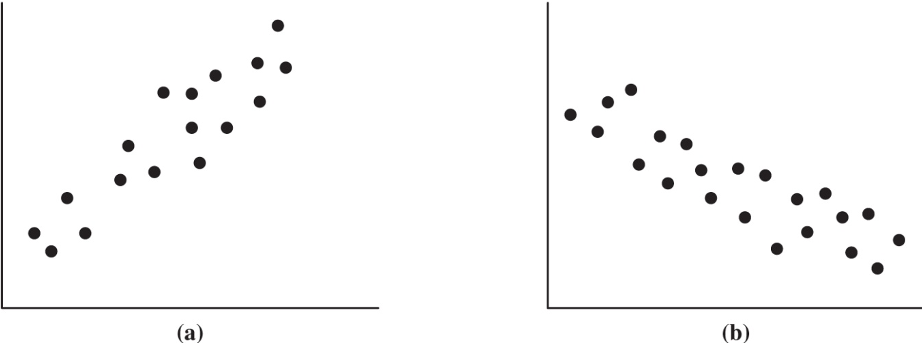
The example scatter plots here show situations where variables are positively or negatively correlated. In other data, the correlation might be more complex.
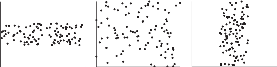
Or perhaps no correlation can be observed here.
References
- Han, Jiawei and Kamber, Micheline (2011). Data Mining: Concepts and Techniques (3rd Edition). Morgan Kaufmann Publishers, San Francisco.
- W. Cleveland, Visualizing Data, Hobart Press, 1993
- T. Dasu and T. Johnson. Exploratory Data Mining and Data Cleaning. John Wiley, 2003
- U. Fayyad, G. Grinstein, and A. Wierse. Information Visualization in Data Mining and Knowledge Discovery, Morgan Kaufmann, 2001
- L. Kaufman and P. J. Rousseeuw. Finding Groups in Data: an Introduction to Cluster Analysis. John Wiley & Sons, 1990.
- H. V. Jagadish, et al., Special Issue on Data Reduction Techniques. Bulletin of the Tech. Committee on Data Eng., 20(4), Dec. 1997
- D. A. Keim. Information visualization and visual data mining, IEEE trans. on Visualization and Computer Graphics, 8(1), 2002
- D. Pyle. Data Preparation for Data Mining. Morgan Kaufmann, 1999
- S. Santini and R. Jain,” Similarity measures”, IEEE Trans. on Pattern Analysis and Machine Intelligence, 21(9), 1999
- E. R. Tufte. The Visual Display of Quantitative Information, 2nd ed., Graphics Press, 2001
- C. Yu , et al., Visual data mining of multimedia data for social and behavioral studies, Information Visualization, 8(1), 2009