
%matplotlib inline
import math
import matplotlib.pyplot as plt
from matplotlib import animation, rc
import numpy as np
import pandas as pd
import seaborn as sns
from numpy import linalg
from scipy import stats
from IPython.display import HTML

plt.rcdefaults()
# plt.xkcd(scale=1, length=300, randomness=5)
mu, sigma = 20, 10
Here we set the mean $\mu$ and standard deviation $\sigma$ to 20 and 10 respectively.
purchases = np.random.normal(mu, sigma, 100)
We use the NumPy's normal distribution model to generate the 100 purchase amounts, just like what you could have done.
Now we show the distribution of your data using a histogram:
count, bins, ignored = plt.hist(purchases, 20, density=True, color=(0.1, 0.1, 0.1, 0.1), edgecolor="black")
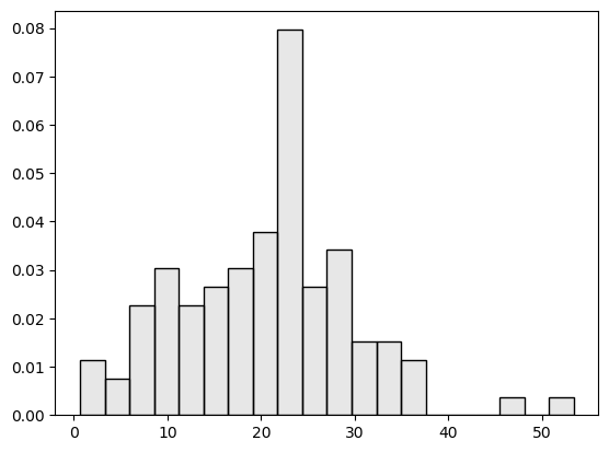
Now that we assume the data follow a normal distribution -- and it does -- the data should follow the normal distribution curve. So let's compare the histogram to the NORMAL model that generates the data.
count, bins, ignored = plt.hist(purchases, 20, density=True, color=(0.1, 0.1, 0.1, 0.1), edgecolor="black")
plt.plot(bins, 1/(sigma * np.sqrt(2 * np.pi)) *
                np.exp( - (bins - mu)**2 / (2 * sigma**2)),
                linewidth=2, color='b')
plt.show()

The blue curve depicts the MODEL, i.e. the normal distribution where the data come from. But it is easy to tell that the actual data, shown as the histogram, do not form the exact bell shape of the model.
The actual spending, for example, may tend to have more purchases with a greater amount, than what the model suggests. This is because the model is probabilistic and comes with a degree of randomness. That leads to the variance in the data and unpredictability of individual data instances.
And this is the noise, which may appear to be outliers but, in fact, comes from the one same model that generates all data here.
In terms of the distribution here, it is very unlikely that you will spend more than 50 dollar on an order:
from scipy.stats import norm
normal_spender = norm(mu, sigma)
prob = 1-normal_spender.cdf(50)
print("How likely is an order of over 50 dollars? {:.2f}".format(prob))
phones = pd.read_csv("data/phones.csv")
phones[['year','calls']].head(10)
phones[['year','calls']].describe()
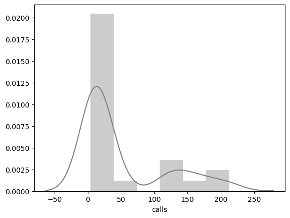
sns.distplot(phones["calls"], color="gray")
phones[['year','calls']].corr(method="pearson")
If we conduct a linear regression based on the classic method of least squares, which is to minimize the sum of squared errors from the mean, we obtain:
from sklearn.linear_model import LinearRegression

x = phones['year'].values.reshape(-1,1)
y = phones['calls'].values.reshape(-1,1)

def lsm_mean():
    lsm = LinearRegression()
    lsm.fit(x, y)
    # print(lsm.intercept_, lsm.coef_)
    global yp
    yp = lsm.predict(x)

    # plt.scatter(x, y,  color='gray')
    plt.plot(x, yp, color='red', linewidth=2)
    plt.xlabel("Year")
    plt.ylabel("# Calls (tens of millions)")
    plt.show()
lsm_mean()
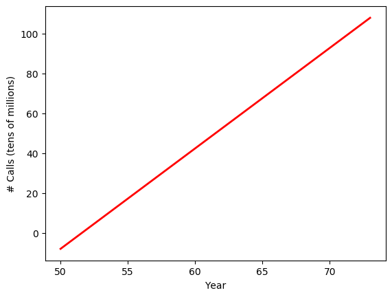
The linear regression model shows the positive relation between year and the number of phone calls. Over time, there is an increasing number of calls from Belgium, which makes sense.
Again, the regression model here is to minimize the sum of least squared errors, from the mean. That is, the model try to fit the regression line along the mean or average over the years.
An alternative regression technique is refered to as the Quantile Regression, which is part of a family of techniques for robust regression. We know that the quantitle at 0.5 or 50% is the middle of all values and is the median. So a quantile regression with q=0.5 is "median regression," based on least absolute deviation.
In this case, when fitting the model, values and errors in the middle have a greater impact on the regression model. Extreme values, which are at the two ends of a distribution, will hardly have an impact on the median error estimate. So outliers will be less likely to impact the results.
import statsmodels.api as sm
import statsmodels.formula.api as smf

def lad_median():
    # rlm = sm.RLM(x, y, M=sm.robust.norms.HuberT())
    rlm = smf.quantreg('calls ~ year', phones)
    rlm_res = rlm.fit(q=0.5)
    # print(rlm_res.summary())
    global yp2
    yp2 = rlm_res.params[0] + x * rlm_res.params[1]

    # plt.scatter(x, y,  color='gray')
    plt.xlabel("Year")
    plt.ylabel("# Calls (millions)")
    plt.plot(x, yp, color='red', linewidth=2, label="Least Square (Mean)")
    plt.plot(x, yp2, color='blue', linewidth=2, label="Least Deviation (Median)")
    plt.legend()
    plt.show()
lad_median()
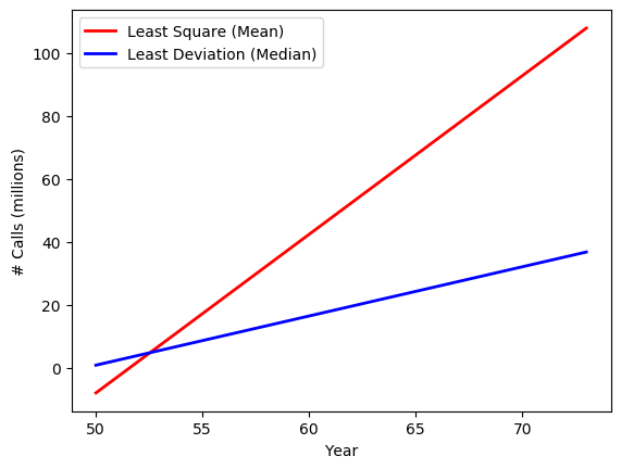
Now after we perform the "median regression", we can compare its regression line (the blue one) to the regression based on least mean squares (the red line). The two lines are very different. In particular , the least mean square model has a much steep regression line. What happened?
def show_data():
    plt.scatter(x, y,  color='gray', label="Data")
    plt.xlabel("Year")
    plt.ylabel("# Calls (millions)")
    plt.plot(x, yp, color='red', linewidth=2, label="Least Square (Mean)")
    plt.plot(x, yp2, color='blue', linewidth=2, label="Least Deviation (Median)")
    plt.legend()
    plt.show()
show_data()
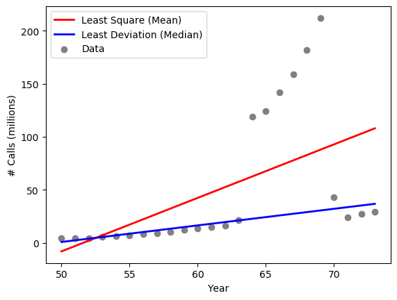
Now if we plot the actual data, the figure gives us some clues about what make the difference.
As shown in the data, there are anomalies in the data, specifically during years 1964 - 1969, where the numbers of calls appear to be unsually greater.
The model based on least mean squares, the red line, is fitting the regression line in terms of mean squared errors. The mean, as we know, is affected by all values. So essentially, the least mean square model is trying to "please" every single data points and the group of outliers will have a major impact on the final regression line, which goes in between the normal data points and outliers.
The "median regression" (so to speak), the blue line, is immune to the outliers because it relies on the median deviation. As you can see, it fits the normal data points very well.
But what are the outliers? What do they represent? Where do they come from?
def show_data_groups():
    phones1 = phones[phones["calls"]<100]
    plt.scatter(phones1["year"], phones1["calls"],  color='black', label="Number of Calls")
    phones2 = phones[phones["calls"]>=100]
    plt.scatter(phones2["year"], phones2["calls"],  color='red', label="Calls in Minutes (mistaken)")
    plt.xlabel("Year")
    plt.ylabel("# Calls (millions)")
    plt.legend()
    plt.show()
show_data_groups()
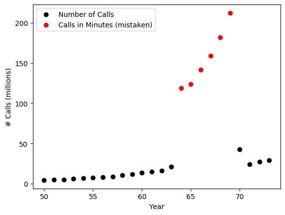
In our definition of outliers, we declare that they must have come from a process or model different from the one that generates the normal data. So if the normal data points come from the number of phone calls Belgium people make? What the outliers?
It turns out that the outliers are still about phone calls from people in Belgium. However, they were mistakenly recorded as the number of minutes, instead of counts of individual calls. So while the black normal data points come from a "counting" process, and the red outliers come from the time log. They are indeed two separate models.
As we discussed, outliers come from a different process or model that generates normal data. These are generative models or stochastic (random) processes hidden behind the data. The idea here is that if we can find out the model that produce normal data, we will then be able to estimate the likelihood or probability of potential outliers.
- Parametric methods: data are generated by a distribution
modelwith parameters. - Nonparametric methods: do not assume a model but try to determine it
from data.
Example, temperature data in °C:
x = [24.0, 28.9, 28.9, 29.0, 29.1, 29.1, 29.2, 29.2, 29.3, 29.4]

Given the above sample data and the NORMAL assumption, how likely are the following?
- A temperature below 0 °C?
- A temperature above 30 °C?
Are the values normal or outliers?
Given normal distribution, two parameters to be estimated:
- Mean: $\hat{\mu} = \bar{x} = \frac{1}{n} \sum_{i=1}^{n} x_i$
- Variance: $\hat{\sigma}^2 = \frac{1}{n} \sum_{i=1}^{n} (x_i - \bar{x})^2$
import math
import numpy as np
mu = np.mean(x)
std = np.std(x)
print("Mean = {:.2f}".format(mu))
print("Deviation = {:.2f}".format(std))
from scipy.stats import norm
model = norm(mu, std)
t1,t2 = 0, 30
print("How likely is a temperature below 0 C?", model.cdf(t1))
print("How likely is a temperature above 30 C?", 1-model.cdf(t2))
Given the observed temperature data, $t_1=0$ is extremely unlikley to be generated by the normal distribution model here and is most likely an outlier.
Some data do not appear to be outlier, until they are viewed in the context. Let's look at the normal age of a working person in the context of demographical groups.
1. Census Income Data
The data are based on the 1994 Census of the U.S.
https://archive.ics.uci.edu/ml/datasets/Adult
The dataset comes with attributes including age, education, sex, and income levels.
people = pd.read_csv("data/adult.data", header=None, skipinitialspace=True)
people.columns = ["age", "workclass", "fnlwgt", "education",
                  "education_num", "marital_status", "occupation",
                  "relationship", "race", "sex", "capital_gain",
                  "capital_loss", "hours_per_week", "native_country",
                  "income"
                 ]
people.head()
people.shape
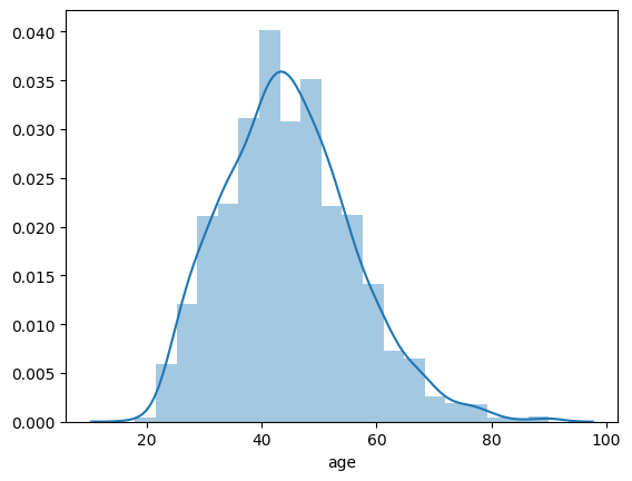
sns.distplot(people['age'], bins=20)
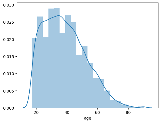
What is the chance of a working 18-year old or younger? Assume a normal distribution.
mu, std = norm.fit(people['age'])
normal_age = norm(mu, std)
p = normal_age.cdf(18)
print("{:.2f}".format(p))
The probability is about $7\%$. It is less common but not necessarily abnormal.
counts = people.groupby('sex').size()
print(counts)
male = people[(people['sex'] == 'Male')]
female = people[(people['sex'] == 'Female')]
print(male.shape, female.shape)
# male_age = male['age']
# female_age = female['age']
# male_age.hist(histtype='stepfilled', color='blue', alpha=0.5, bins=20)
# female_age.hist(histtype='stepfilled', color="red", alpha=0.5, bins=20)
sns.distplot(male['age'], color='blue', bins=20)
sns.distplot(female['age'], color='red', bins=20)
# female_age.hist(density=True, histtype='stepfilled', color="red", alpha=0.5, bins=20)
# male_age.hist(density=True, histtype='stepfilled', color=sns.desaturate("blue",.75), alpha=0.5, bins=20)
counts = people.groupby('education').size()
print(counts)
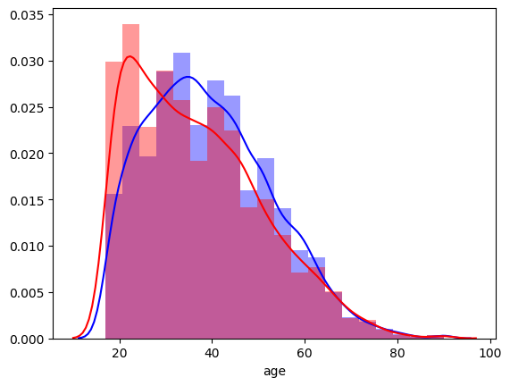
Consider people with a Masters or Doctorate degree:
graduate = people[(people['education'] == 'Masters') | (people['education'] == 'Doctorate')]
sns.distplot(graduate['age'], bins=20)
Again, we can estimate the normal distribution based on the sample with a graduate degree:
mu, std = norm.fit(graduate['age'])
print(mu, std)
normal_graduate_age = norm(mu, std)
How likely is age=18 or younger in the population with a graduate degree?
p = normal_graduate_age.cdf(18)
print("{:.3f}".format(p))
The chance is $<1\%$. It is quite abnormal and suggests likely outliers in the context of having a graduate degree.
References
- Han, Jiawei and Kamber, Micheline (2011). Data Mining: Concepts and Techniques (3rd Edition). Morgan Kaufmann Publishers, San Francisco.
- Ian H. Witten, Eibe Frank, Mark A. Hall, Christopher J. Pal (2017). Data Mining: Practical Machine Learning Tools and Techniques (Morgan Kaufmann Series in Data Management Systems) 4th Edition.
- Laura Igual and Santi Seguí (2017). Introduction to Data Science: A Python Approach to Concepts, Techniques, and Applications. Springer.